Using lightweight A/B Testing to 2x brands conversion rate

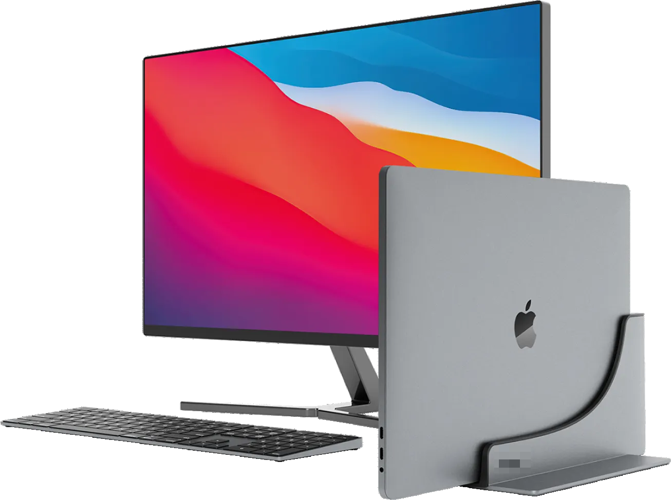
This project was for a MacBook accessories brand specializing in unique docking stations. The brand contacted CRO Gurus aiming for conversion rate improvements to help & enable the scaling of their business. After the initial call, we decided on the ongoing store optimization program that includes not only initial suggestions for the client's store but also an ongoing data-driven testing program to help the brand validate the success of these new store changes.
On top of the conversion rate challenge, we simultaneously aimed to boost average order value to take advantage of this multiplier effect where visitors are converting with a higher rate, but they are also doing so at a higher price point. In most cases balancing the conversion rate and the average order value is a tricky thing to get right, which is why we used revenue per visitor as the ultimate judge of the success of the program.
From our initial benchmarking comparing the brand to similar stores in our portfolio, we found that there were performance issues all along the funnel; most notably, the PDP performance was terrible, with very few people adding the product to the cart, and once they did there were high drops during the cart & checkout process. The higher pricepoint partly explained this & the explanation needs of the product, nevertheless, there was reason to believe that significant improvements could be achieved. This initial analysis pointed us to an approach that was less conservative as there wasn’t as much risk of performance loss, and the less the brand has to lose, the less they have to worry about the downside.
We started with the optimization plan for the site & implemented many suggestions already that the brand agreed were no-brainers. This likely gave us an initial performance boost, but as they agreed to move quickly, we just implemented these changes & won’t have measured data for it (which is why we focus on the testing part of this case study).
The initial fixes took a couple of weeks to implement, after which we initiated our A/B testing program focusing on two key sales funnels.
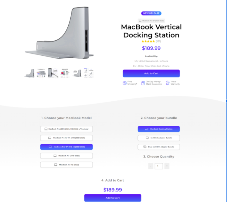
The store's initial approach centered on a special landing page for its top-selling docking station. This page was crucial for their overall strategy, as the majority of the cold traffic was driven through this funnel. Understanding its significance, our goal was to optimize this funnel for maximum impact.

The second approach, which was more common & traditional, also brought in a lot of visitors. Our aim was to improve this funnel and understand if two funnel approach is the right approach or if we should move to one funnel approach. To decide on this, we first needed to better understand the overall potential of this funnel.

Overall the funnel is the same, but it skips the landing page. This funnel can be useful for people who have more context of the brand already (for example, remarketing) or when used with affiliates.
During our collaboration with the client, we initiated 11 tests. With our past experience and testing planning methodology, we were able to achieve a 70% win rate for our A/B tests.
Due to the low overall transaction levels of the client, we focused our testing on the most important pages, such as the landing, product, and cart page. Our plan was to keep a consistent flow of two to three tests running at any given time, making sure we fully leverage store traffic. In the end, our testing efforts boosted clients' revenue by $150,000 over the next six months; in the following, we’ll dive deeper into the individual tests contributing to this improvement.
One of the best ways to start the testing program is to remove friction points. Oftentimes Shopify themes contain unnecessary elements that can act as a distraction and lower customer click-through-rate. The client shared with us the customer’s frustrations.
Most of these complaints were about page usability and lack of clarity.
These issues led us to create a 2-part strategy:
- Focus on simplifying the store
- Improve clarity with selectively added new elements.
On the cart page, taking out suggested products made a big difference.
This streamlined approach on desktop led to a +28% lift in conversion rate and a 45% rise in revenue per visitor for desktop visitors. On mobile, the test was flat with no detectable effect. Even though we would have preferred to be certain of both device types for simplicity, we implemented the same version on both mobile and desktop, knowing that it was a sensible financial decision for the client (minimizing the cost of testing & opportunity cost while maximizing the expected performance).


For our next test, we suspected that having too many checkout options might be a big contributor to the cart page abandonment rate. By removing express checkout options, mobile users experienced a 46% revenue increase (99% confidence); on desktop, we experienced a 10% (75% confidence.
By reducing multiple checkout options to a single option, users focused on taking one action instead of selecting from multiple competing actions.


On the landing page, we removed the header menu, focusing the customer’s attention on the page content. This change resulted in a 12% conversion rate lift for both mobile and desktop. The test goal was to remove links that lead customers outside of the page. We wanted people to only be able to proceed to the product page eliminating all competing options.

After our first successful landing page test, we continued on the path of removing friction elements. We set up a test where the main CTA was changed from 6 product options to only 1


This test was a big success for mobile view. The new version showed a whopping 55% conversion rate increase. Even with the desktop not showing significant improvements, this was a hugely impactful test for us since it enabled us to significantly improve the add-to-cart rate, which was the main weakness identified during the initial benchmarking.
Learn how you can also increase your store's eCommerce conversion rate today
Learn how you can also increase your store's eCommerce conversion rate today
The store was receiving a noticeable amount of organic traffic on the homepage. This opened up an opportunity to run a test on the homepage. We tested focusing more on social proof by adding an ‘as seen in’-section. Due to being top of the funnel & the long customer journey, we weren’t able to link this change to conversion rate or revenue change, but it did show an improvement in metrics like bounce rate and engagement rate.
The decision was made to keep the social proof on the page & adjust to the merchants' situation, as with smaller stores, we won't have enterprise-level volume for proper scientific validation. We chose to go with the second best thing - using page micro metrics like bounce rate, click-through rate and engagement rate rather than purely relying on macro metrics like transactions and revenue.
After successful tests on the cart page, landing page, and homepage, we started to look and ideate on product page improvements. One of our most significant experiments was related to the hero section redesign. This new design directly tackled a specific customer concern/complaint.


Across various alterations and tests, we aimed to remove initial customer confusion and created an improved page layout. This effort culminated in a noteworthy 25% revenue per visitor increase for desktop users.

In conclusion, we ran 10 A/B tests after our initial suggestions were published. Our A/B testing program was highly successful and resulted in a 70% A/B test win rate. Although we also encountered losing test versions along the way, these tests were ended early to minimize losses (especially the lost opportunity cost). The overall results were highly satisfactory.
Altogether, these tests resulted in a revenue uplift of $150,000 over the next six months. This store's journey showcases how strategic A/B testing can refine customer experiences, boost conversion rates, and drive business growth. As demonstrated here, a systematic A/B testing approach can be a game-changer for eCommerce companies lacking a functional & active testing process.
"We've worked with Samuel and his team for multiple months. They generally follow a good and strategic approach and can handle everything from ideation to implementation (development). Very open to feedback and adjusting to what is needed.”
Founder & CEO
.png)
.png)


.png)

%20(1).png)


